by Pushp Jain
Have you ever come across the problem where your website looks too dull or too colourfull? Has it ever felt like your website is for nursery kids or for a circus promo? Do you wanna make your websites look more professional? Well, the answers for all those questions are right here in this blog, Read more to unravel it all...
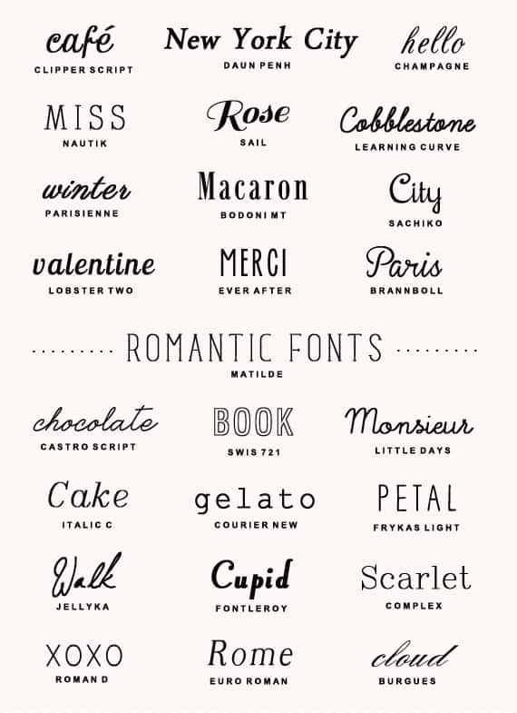
1.No more than two fonts
Select a single font for your website, or atmost two and use this particular font for all of your website because too many pattern changes are not pleasing to the eyes. You may use diff text decorations and weights for minor changes, this looks more more sober and professional. This way you make readability of your website better.
2.Set a color theme
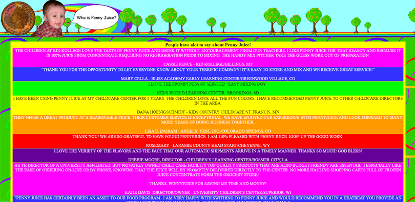
You should always decide an eye catching color theme which is subtle as well at same time. Select a primary, secondary and tertiary color decide what color goes where, for example button has primary color and on hover it turns to secondary color. Always use a lilttle darker shade of white and a little lighter shade of black for better aesthetics. Do not forget to pick lighter and darker shades of your primary color for minor color variations. An example of a really bad website is given below.
3.Have proper spacing
I have seen many famous and professional websites commit this mistake, which is to shove features in the face of the app, button after button making it really difficult to find the features that I actually wanted to use. One such example of a bad site would beamazon'sofficial site. You should always make sure your website has aproppriate amount of blank spaces, this not only makes your website look beautiful but also makes it easy for the user to move around your site.